
12 Best AI Infographic Generator Tools 2026 Compared
Compare 12 AI infographic generator tools for editable visuals, data storytelling, templates, exports, pricing limits and team workflow fit.
On this page
If a report, lesson, campaign brief or customer deck has to become a clear visual by tomorrow, a generic image generator is usually the wrong tool. It may produce something attractive, but the numbers can be hard to edit, the layout may not survive review, and the final asset may fail the first brand or export requirement. The best AI infographic generator is the one that turns text, data, notes or documents into a structured visual you can still revise.
This guide compares 12 AI infographic generator tools for 2026 using ToolWorthy's five-part evaluation model: functionality, user experience, innovation, value for money and user feedback. We used a Codex Browser Deep Research pass on August 13, 2026, then normalized the results around editable output, data and chart support, brand controls, export formats, public pricing, review evidence and whether the workflow is truly infographic-first. For broader visual workflows, compare this list with our AI infographic generator category, AI data visualization tools, and AI graphic design tools.
| Tool | Best For |
|---|---|
| Piktochart | Fast editable infographics from prompts, text and documents |
| Venngage | Brand-controlled business infographics from files and data |
| Napkin AI | Turning rough text into clean business visuals |
| Canva | Teams that need templates, editing and broad design output |
| Powerdrill Bloom | Data-first infographics from spreadsheets and PDFs |
| Adobe Express | Adobe users needing polished quick visual assets |
| Genially | Interactive and animated educational or marketing infographics |
| Gamma | Narrative visuals for decks, docs and social explainers |
| EdrawMax | Diagram-heavy infographics with desktop and web editing |
| Visme | Branded reports, charts and team visual communication |
| Infogram | Interactive data charts, maps and embeddable infographics |
| Jeda.ai | Emerging editable AI whiteboard and infographic workflows |
How We Selected and Tested
We selected these AI infographic generator tools based on measurable buyer criteria: the product had to support English-language use, work for users in the US, Canada, UK or EU, and help create infographics or visual reports from prompts, text, data, documents, URLs or structured ideas. Tools that only generate a single raster image, sell templates, or focus mainly on logos, avatars, posters or generic AI art were excluded unless they offered a credible editable infographic workflow.
Our research methodology combined official product pages, pricing pages, help centers, public review sources and related ToolWorthy content. We separated dedicated infographic builders from broader products such as AI presentation maker tools and AI image generators, because the buyer risk is different: infographic work needs editable structure, data accuracy, export control and review loops. Pricing and product signals were checked during the August 13, 2026 research pass.
Evaluation Dimensions: We evaluated each tool across five weighted dimensions:
- Functionality - prompt, text, document and data input; chart support; editable layouts; brand controls; collaboration; export formats.
- User Experience - browser workflow, speed from first prompt to usable draft, editor clarity, review flow, mobile limits and account restrictions.
- Innovation - how well the AI understands information structure, data narrative, visual hierarchy and iterative editing rather than only making a picture.
- Value for Money - public pricing, free tier quality, AI credits, download limits, watermarks, team pricing and hidden export gates.
- User Feedback - independent review evidence, sample size and recency. When reliable independent feedback was missing, we used a conservative score instead of inferring satisfaction from testimonials.
Note on Testing Scope: This is public-evidence research, not a paid account benchmark across every tier. We did not claim private testing of every export format, enterprise admin panel or AI credit edge case. When pricing pages used sales-led or localized pricing, we noted the uncertainty instead of inventing plan limits.
Transparency & Limitations: AI visual products change quickly. Always recheck the current official pricing page, commercial license language, privacy policy and export limits before buying an annual plan. The ranking favors tools that produce editable, reviewable infographic assets over tools that simply make attractive one-off images.
Top 12 Best AI Infographic Generator Tools Compared
The table below is ranked for people who need production-ready visual communication, not novelty demos. A high ranking means the tool combines AI generation, editable structure, useful templates or charts, export control and credible buying evidence. Lower-ranked tools can still be excellent when their narrower workflow matches your use case.
| Tool | Best For | Input Strength | Editing Control | Pricing Watchout |
|---|---|---|---|---|
| Piktochart | Reports, notes and documents into editable visuals | Prompt, text, data summary, document | Strong visual editor | AI credits and advanced downloads |
| Venngage | Business infographics with brand governance | Prompt, files, CSV/Excel-style data | Strong templates, charts and Brand Kit | Premium exports and team controls |
| Napkin AI | Turning text into shareable business visuals | Text, docs and selected content | Fast visual editing | Free visuals keep branding |
| Canva | Broad design teams that also need infographics | Templates, prompts, brand assets | Excellent general editor | AI allowances vary by plan |
| Powerdrill Bloom | Spreadsheet and PDF data storytelling | Excel, CSV, PDF, topic prompts | Analysis-first visual output | Credit-based plan limits |
| Adobe Express | Quick branded assets inside Adobe workflows | Templates, prompts, assets | Strong general editor | Premium assets and AI credits |
| Genially | Interactive learning and marketing visuals | AI builder, templates, imported files | Interactive editor | AI credits and paid downloads |
| Gamma | Narrative decks, docs and social explainers | Text, raw data, insights | Card/story editing | Credit usage and plan caps |
| EdrawMax | Diagram-style infographics and workflows | Text, docs, webpages | Deep diagram editor | Subscription plus AI token costs |
| Visme | Branded charts, reports and team visuals | Templates, charts, data widgets | Strong visual editor | Downloads and Brand Kit gated |
| Infogram | Interactive data charts and embedded visuals | Data imports, charts, maps | Strong data visualization | Business features start higher |
| Jeda.ai | Experimental editable AI infographic canvas | Prompt, data, documents, web search | Agentic canvas editing | Independent feedback is limited |
Detailed Reviews

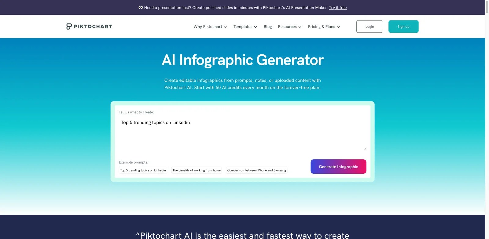
Teams choose Piktochart when the hard part is turning messy source material into a visual that still survives editing. It is one of the clearest matches for this category because the workflow covers prompts, pasted text, reports, notes, data summaries and uploaded documents, then keeps the output editable. That makes it safer than an image-only generator for marketers, educators, analysts and nonprofit teams that need reviewable infographics.
Key Features
- Document and text-to-infographic workflow: Piktochart can start from a topic, text, notes, data summary or document, which reduces the manual outline step before design work begins.
- Editable sections after generation: The generated result is not treated as a final flat image. Users can adjust text, colors, fonts, icons, images and sections.
- Practical brand and export controls: Pro adds unlimited PNG downloads, more AI credits and premium assets, while Business adds Brand Kit controls plus PDF and PowerPoint exports, which matters when visuals need to be reused across campaigns or reports.
Pricing & Plans
Piktochart lists Free, Pro, Business and Enterprise plans. As of the August 13, 2026 research pass, Pro was listed from $10 per member per month billed annually, Business from $17 per member per month billed annually, and Enterprise used custom pricing. Free accounts can test the workflow, but AI credits, downloads, storage, brand controls and PDF/PPT exports are the main upgrade triggers.
Pros & Cons
Pros
- Strongest all-around fit for editable AI infographic creation
- Handles text, data summaries and uploaded documents
- Clear plan structure and monthly AI credit model
Cons
- Heavy users may need paid AI credit packages or higher tiers
- Brand Kit and advanced exports are not free-tier features
- It is less specialized for live interactive charts than Infogram
Best For
Choose Piktochart if you want the safest first pick for prompt, document or report-to-infographic work. It is not the right fit if your priority is live embedded data dashboards rather than downloadable visual reports.
Get started with Piktochart

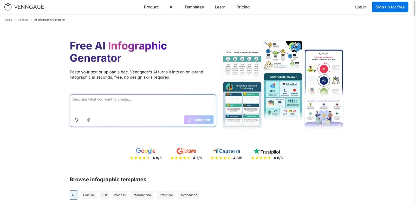
Venngage fits teams that cannot publish a visual until the data, layout and brand treatment are all reviewed. Its AI infographic generator sits inside a mature business design product with templates, charts, Brand Kit, file inputs and export options. That makes it especially useful for HR, marketing, internal communications and operations teams that need repeatable business-approved visuals rather than one-off AI art.
Key Features
- Strong file and data support: Venngage is strongest when a brief, document or spreadsheet-style source needs to become a structured infographic with charts and visual hierarchy.
- Brand Kit and team workflows: Business and Enterprise plans support brand controls, private sharing and team collaboration, which helps non-designers stay inside visual rules.
- Large template library: The template base reduces blank-page time and gives reviewers a familiar editing surface after AI generation.
Pricing & Plans
Venngage lists Free, Premium, Business and Enterprise plans. The August 13, 2026 check found Free at $0, Premium from $10 per month on annual billing, Business from $24 per user per month on annual billing, and Enterprise starting at $499 per month. Premium unlocks unlimited designs and PNG export; Business adds Venngage AI, PDF and PowerPoint export, Brand Kits, folders and team sharing.
Pros & Cons
Pros
- Best fit for branded business infographics
- Strong template, chart and export coverage
- Better governance path than lightweight AI visual tools
Cons
- Valuable business features sit behind paid tiers
- The editor is more structured than a freeform whiteboard
- Enterprise pricing can be overkill for solo creators
Best For
Choose Venngage if your organization needs brand-safe infographics for recurring business communication. It is not the right fit if you only need occasional free visuals without private export or team controls.
Get started with Venngage
Napkin AI
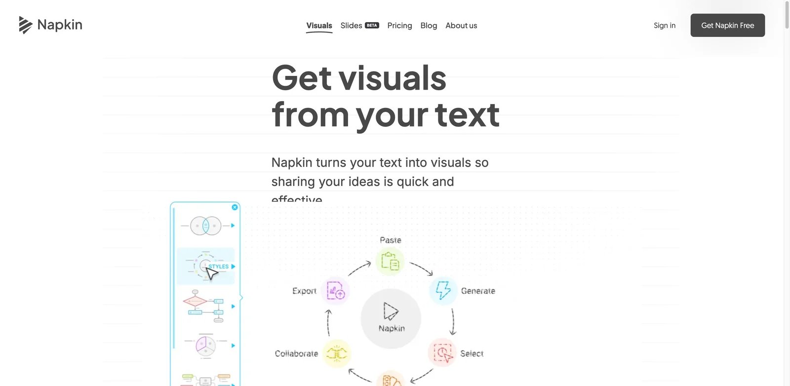
Napkin AI is for people who already have words but need the visual structure fast. Instead of asking users to pick a template first, it turns selected text into diagrams, charts, scenes and infographic-style visuals, then lets them refine the result. That makes it a strong fit for founders, consultants, content marketers and product teams that need crisp business visuals inside docs, decks or posts.
Key Features
- Text-first visual generation: Napkin starts from existing written content, which is faster than rebuilding the message inside a design template.
- Generous editing workflow: Free and paid plans include unlimited visual editing, so teams can refine generated output instead of treating it as disposable.
- Useful export ladder: Free includes PNG and PDF export, while paid plans add PPT and SVG export, branding removal and stronger brand styles.
Pricing & Plans
Napkin lists Free, Plus, Pro and Enterprise options. The current pricing page shows Free with 500 AI credits per week and Napkin branding, Plus at $9 per person per month billed annually with 10,000 monthly AI credits, and Pro at $22 per person per month billed annually with 30,000 monthly AI credits; month-to-month billing is higher. Enterprise is sales-led. Paid tiers remove branding and expand exports, brand styles and credit limits.
Pros & Cons
Pros
- Excellent speed from text to visual
- Strong free tier for lightweight testing
- PPT and SVG export on paid plans
Cons
- Mobile creation and editing are limited compared with desktop
- It is less of a traditional long-canvas infographic builder than Piktochart or Venngage
- Credit usage depends on selected words and future feature complexity
Best For
Choose Napkin AI if your source material already exists as notes, outlines or prose. It is not the right fit if you need deep chart-data editing, enterprise brand governance or a classic template-heavy design workspace.
Get started with Napkin AI

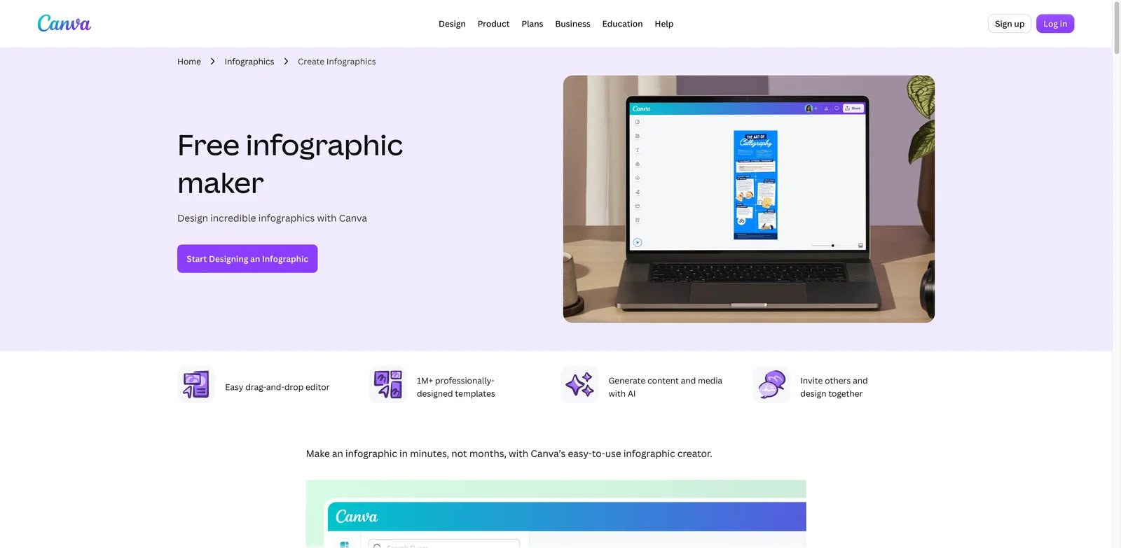
Canva is the practical choice when infographics are only one format in a larger content calendar. The AI features are not as narrowly infographic-first as Piktochart or Venngage, but the editor, template ecosystem, assets, collaboration tools and brand workflows are difficult to beat. If the same team also makes social posts, posters, presentations and quick campaign graphics, Canva may be the most efficient stack choice.
Key Features
- Huge design ecosystem: Canva gives non-designers templates, stock assets and a familiar editor for many formats, so infographic work can share the same brand system as other visuals.
- AI inside a broad editor: Magic Studio and Canva AI features help with design generation, copy, image editing and content variation without leaving the workspace.
- Team and business controls: Business and Enterprise plans add higher AI allowances, more Brand Kits, governance features and administrative controls.
Pricing & Plans
Canva lists Free, Pro, Business and Enterprise plans. The August 2026 pricing page showed Free at $0, Pro at US$144 per year for one person, Business at US$250 per year per person, and Enterprise on custom pricing. The key buying detail is AI allowance: paid tiers include much larger AI usage limits than Free, and some advanced AI capacity may require add-ons.
Pros & Cons
Pros
- Best general-purpose editor in this list
- Excellent templates, assets and collaboration
- Strong fit when infographics are part of broader visual production
Cons
- AI infographic automation is less specialized than dedicated tools
- Serious teams must monitor AI allowances and plan changes
- Broad feature depth can distract from data-accurate infographic review
Best For
Choose Canva if your team wants one design workspace for infographics, social assets, presentations and campaign visuals. It is not the right fit if your main need is automated document-to-infographic or data-to-chart precision.
Get started with Canva
Powerdrill Bloom
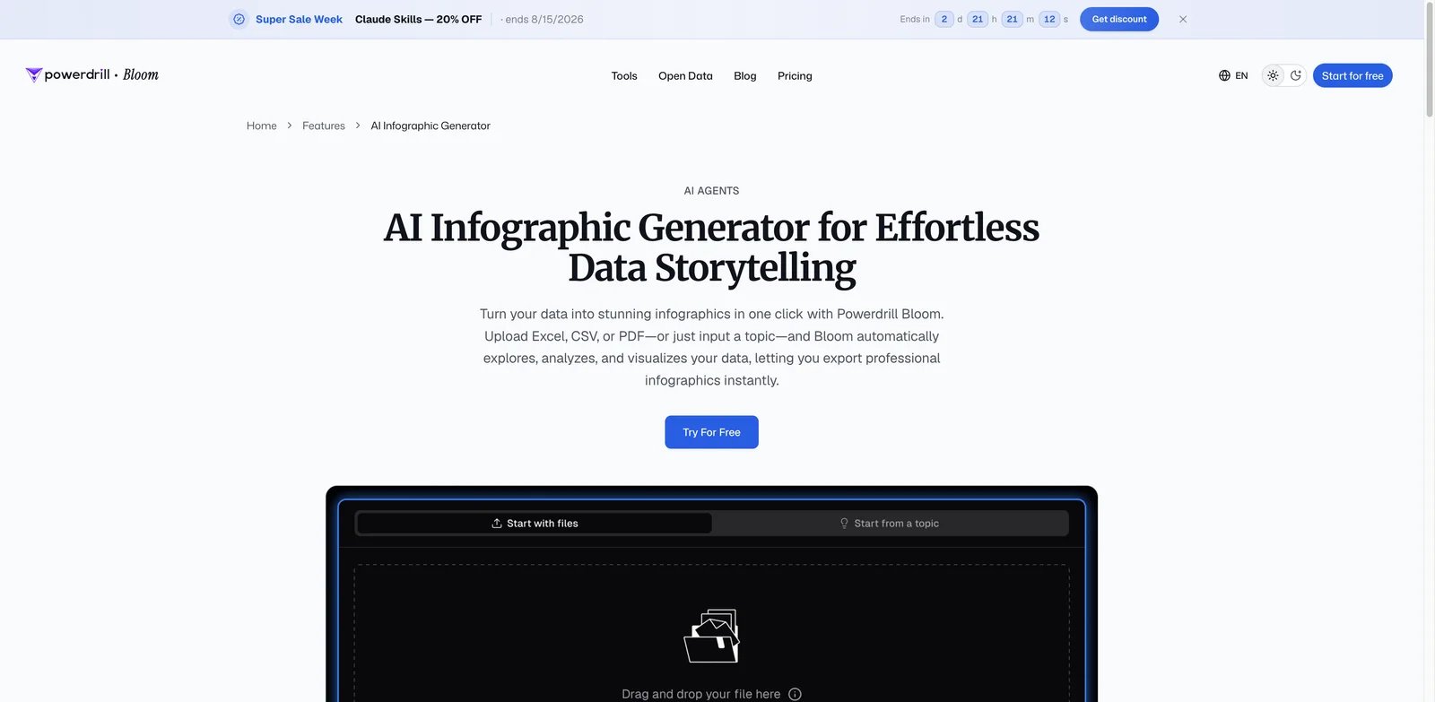
Powerdrill Bloom stands out when the source is data rather than copy. It is designed to turn Excel, CSV, PDF, documents or topic prompts into analysis, charts and visual outputs. That makes it more relevant for analysts, finance teams, market researchers and operators who need an infographic to explain data, not just decorate a message.
Key Features
- Data-first workflow: Bloom can ingest spreadsheets and documents, then generate insights, charts and visual reports from the same workspace.
- Agent-style analysis: The tool is stronger than template editors when the user needs the AI to reason through a dataset before choosing charts.
- Flexible output workspace: Plans include agent skills and document, slide, sheet or image creation, so the infographic can sit inside a broader research workflow.
Pricing & Plans
Powerdrill Bloom lists Free, Pro, Plus, Premium, Team Pro and credit packages. The August 2026 pricing page showed Free at $0, Pro from $13.27 per month on first-year annual promotional billing, Plus from $26.60 per month, Premium from $132.67 per month, and Team Pro from $13.27 per seat per month on first-year annual promotional billing. Because promotional prices and credits are central to the offer, recheck the live pricing page before purchase.
Pros & Cons
Pros
- Strongest data-to-infographic angle in the ranking
- Handles files and analysis before visualization
- Useful beyond infographic creation
Cons
- Independent review evidence is smaller than mature design tools
- Credit accounting matters for heavy analysis workflows
- Less ideal for brand-heavy marketing templates than Canva or Venngage
Best For
Choose Powerdrill Bloom if your infographic starts with data analysis, not a blank design. It is not the right fit if you only need polished social graphics with minimal analytical work.
Get started with Powerdrill Bloom

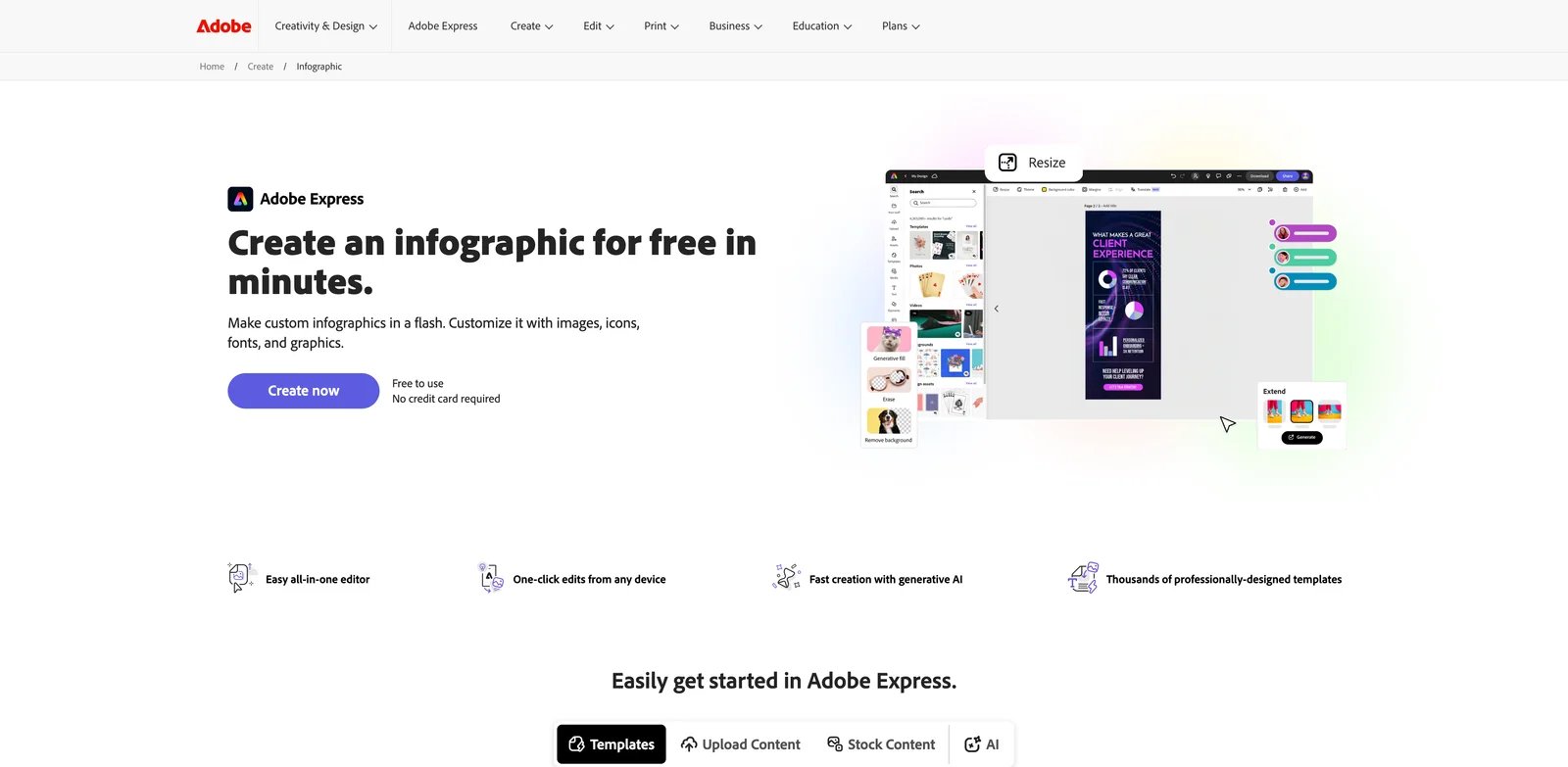
Adobe Express makes sense when the buyer wants fast infographic production but already trusts Adobe's creative ecosystem. It combines templates, an all-in-one editor, generative AI and brand-friendly output. The category fit is strongest for quick marketing, education and internal communication assets, not for highly analytical data visualization.
Key Features
- Polished quick-start editor: Adobe Express reduces the time from idea to visual for users who do not want the complexity of full Creative Cloud tools.
- Generative AI and premium assets: Paid plans unlock more creative assets and AI capacity, useful for teams producing many branded visual variants.
- Cross-format design workflow: Infographics can sit alongside flyers, posts, videos and other quick-turn assets.
Pricing & Plans
Adobe's current US pricing page lists Adobe Express Free, Acrobat Express, Acrobat Express for Teams and Acrobat Express for Enterprise, with separate student and educator options. The current US page lists Acrobat Express at US$10.99 per month with no annual commitment and Acrobat Express for Teams at US$11.99 per license per month on an annual subscription; both include 250 monthly generative credits, while the Teams tier adds organization-level controls and collaboration features.
Pros & Cons
Pros
- Strong general design quality
- Familiar for Adobe-oriented teams
- Good for quick polished business visuals
Cons
- Not as infographic-specific as Piktochart or Venngage
- Plan and regional pricing details need live confirmation
- Deep data visualization is not its strongest use case
Best For
Choose Adobe Express if your team wants fast visual assets inside an Adobe-friendly environment. It is not the right fit if you need precise spreadsheet-to-infographic automation or embedded interactive charts.
Get started with Adobe Express

Genially is strongest when a static infographic is not enough. Educators, trainers, marketers and internal communications teams use it for interactive and animated content, so readers can click, explore and move through a visual story. Its AI Builder and interactive editor make it more distinctive than simple template tools.
Key Features
- Interactive infographic format: Genially supports animations, interactions and clickable elements, which helps explain layered content without cramming everything into one flat graphic.
- AI-assisted creation: AI credits can be used for text, creation, questions, components and other assistance depending on plan.
- Education and training fit: Imports, templates and LMS-friendly workflows make it useful when the infographic is part of learning content.
Pricing & Plans
Genially's current main pricing structure includes Free, Pro, Master, Author and Enterprise; classroom and student pricing are listed separately. The August 2026 plan page showed Free with 500 AI credits per year, Pro with 2,000 AI credits per year, Master with 5,000 AI credits per seat per year, and Author with 10,000 AI credits per seat per year. Some localized pricing fields were not clearly exposed in the page crawl, so confirm current prices in your region before purchase.
Pros & Cons
Pros
- Best interactive and animated infographic option here
- Strong education and training use case
- Free plan can test core interactive creation
Cons
- AI credits vary by plan and feature
- Download and offline features require paid plans
- Static business report teams may prefer Piktochart, Venngage or Visme
Best For
Choose Genially if your infographic needs interaction, animation or learning engagement. It is not the right fit if you only need the fastest static chart-based report export.
Get started with Genially
Gamma
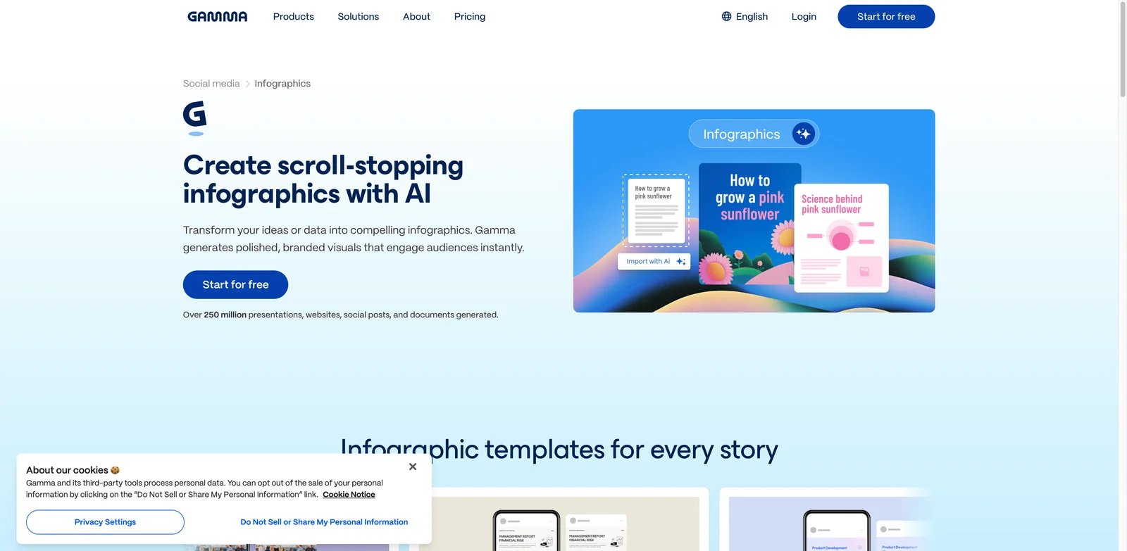
Gamma fits teams that think in narratives rather than canvases. It can turn raw data, text and insights into structured visual stories across decks, docs, web pages and social assets. That makes it useful when an infographic is part of a broader explanation, pitch or launch story rather than a standalone poster.
Key Features
- Narrative-first generation: Gamma is strong at organizing content into cards, sections and visual flow, which helps when the message needs more than one chart.
- Infographic and social output paths: The product supports infographic-style social visuals while still connecting to decks and docs.
- Useful AI integrations: Connectors and API access can extend the workflow, although API access depends on paid plan level.
Pricing & Plans
Gamma lists Free, Plus, Pro, Ultra and team/business tiers. Public pages showed Free with limited prompt output and export support, Plus for removing Gamma branding and adding stronger AI image models, Pro for premium AI models, API access and customization, and Ultra for higher-end AI usage. Credit usage varies by model, number of cards and image generation, so check current billing behavior before scaling.
Pros & Cons
Pros
- Excellent for visual storytelling
- Useful when one input becomes a deck, doc or social asset
- Strong innovation score for narrative structuring
Cons
- Less precise as a traditional data-heavy infographic editor
- Credit usage can be hard to estimate for large outputs
- Independent infographic-specific feedback is thinner than mature design tools
Best For
Choose Gamma if you need a visual story that may become a deck, doc, web page or infographic post. It is not the right fit if you need strict chart-data editing and final print-ready infographic control.
Get started with Gamma
EdrawMax
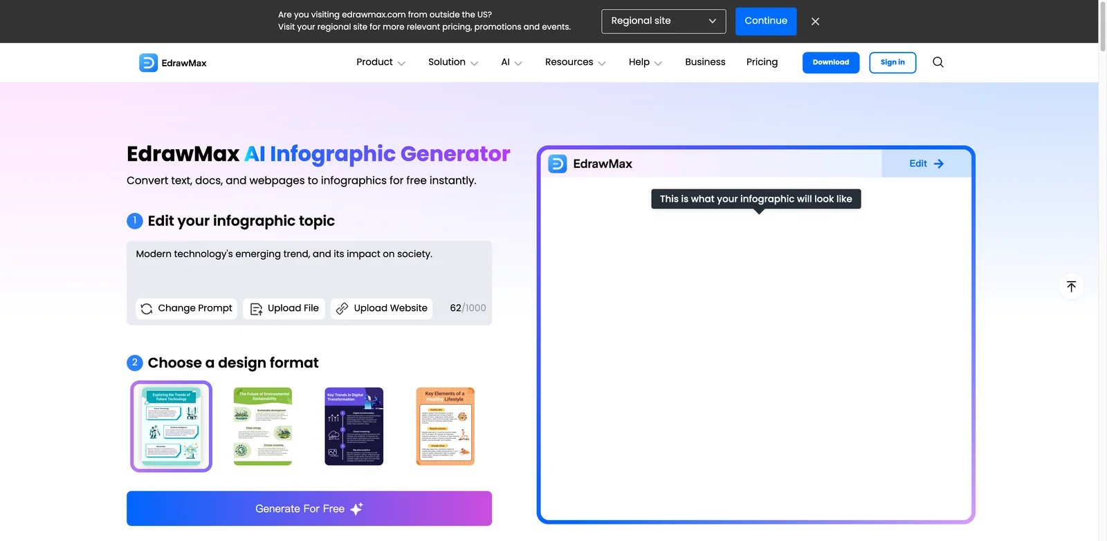
EdrawMax is useful when the infographic is close to a diagram, flow, process map or technical explainer. It has a deeper diagramming heritage than many design-first tools, so it can support structured visuals that would feel cramped in a simple template editor. The tradeoff is that its breadth can create more learning overhead.
Key Features
- Diagram and infographic depth: EdrawMax is stronger than lightweight builders for workflows, process graphics and structured technical visuals.
- AI generation from text and documents: The AI infographic path supports turning source material into a previewable visual that can be edited in the broader diagramming environment.
- Desktop and web flexibility: Users who prefer installed software can work beyond a browser-only experience.
Pricing & Plans
EdrawMax uses product subscriptions, perpetual license options and separate AI/creative asset or token-style purchases. The August 2026 checks showed annual and perpetual product pricing, plus AI token packages such as 50,000 tokens for $5.90, 100,000 tokens for $9.90 and 999,999 tokens for $79.90. Treat total cost as product licensing plus AI usage. Edraw's current AI pricing page states that the AI function is for learning and communication, not commercial purposes; commercial users should seek written clarification from Edraw before publishing AI-generated infographics.
Pros & Cons
Pros
- Strong for diagram-heavy infographics
- Useful desktop and web coverage
- Large diagram/template ecosystem
Cons
- Pricing can involve multiple product and AI-token components
- More complex than simple infographic builders
- Less modern for quick marketing visuals than Canva or Adobe Express
Best For
Choose EdrawMax if your infographic is really a process map, system explanation or technical diagram. It is not the right fit if you want a lightweight social-media infographic generator.
Get started with EdrawMax

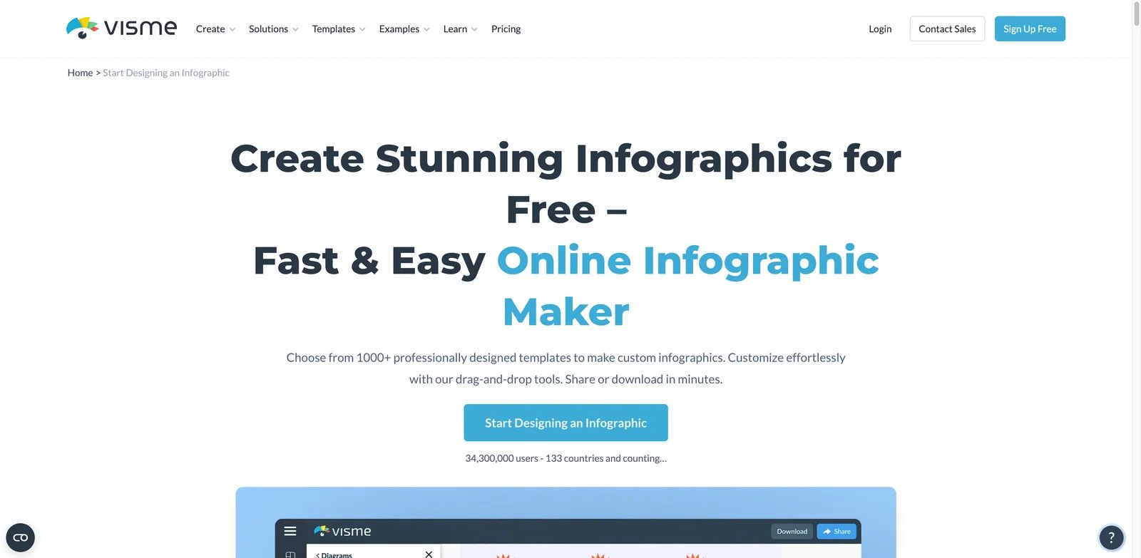
Visme is built for teams that produce infographics, presentations, reports and branded content repeatedly. It is not only an AI generator; it is a visual communication workspace with templates, charts, data widgets, analytics, privacy settings and Brand Kit features. That makes it a strong operational choice for marketing and internal communications teams.
Key Features
- Report and infographic editor: Visme handles charts, data widgets and visual layouts for teams that need more than a prompt-to-image result.
- Brand and privacy controls: Pro and Enterprise features support branded output, analytics, privacy settings and team governance.
- Many export formats: Paid tiers unlock broader downloads such as PPTX, HTML5, video and GIF, which helps repurpose one infographic across channels.
Pricing & Plans
Visme lists Basic, Starter, Pro and Enterprise plans. The August 2026 pricing page showed Basic free, Starter at $12.25 per person per month billed annually, Pro at $24.75 per person per month billed annually, and Enterprise custom from 10 users. Basic is useful for testing, but serious download, brand and privacy needs push most teams to paid plans.
Pros & Cons
Pros
- Strong visual communication suite
- Good fit for reports and branded content
- Clear annual pricing for Starter and Pro
Cons
- Advanced downloads and Brand Kit are gated
- Less AI-native than newer agentic tools
- Enterprise starts at larger team requirements
Best For
Choose Visme if your team produces recurring branded reports, charts and infographics. It is not the right fit if you only want the fastest AI-generated visual from a paragraph of text.
Get started with Visme

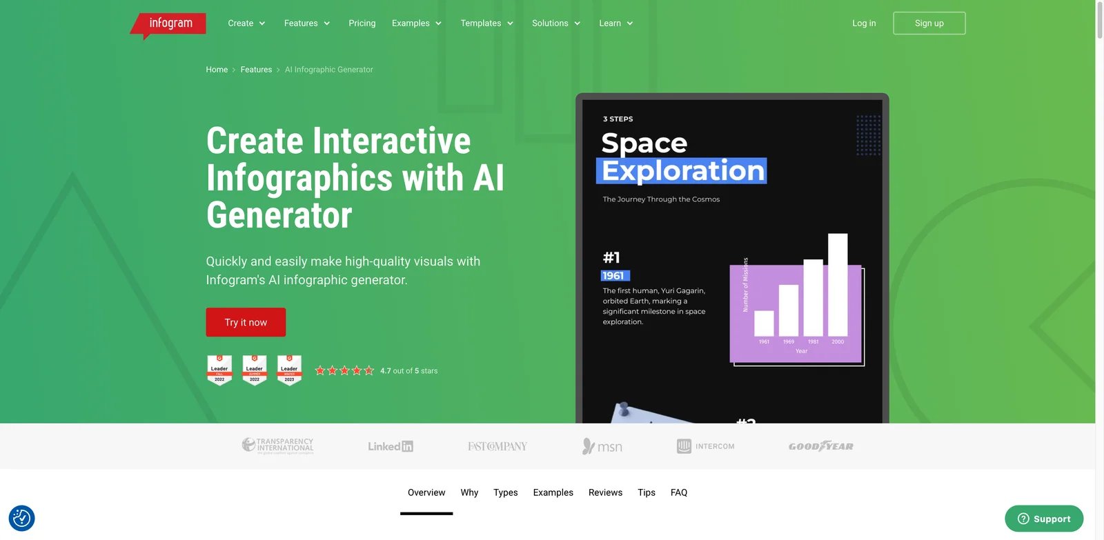
Infogram is the strongest choice when the infographic must carry real data. Its product is built around interactive charts, maps, data imports, embeds and visual storytelling rather than decorative design alone. That makes it useful for publishers, analysts, nonprofits, educators and business teams that need visuals people can explore or embed.
Key Features
- Interactive data visualization: Infogram's chart and map library is the main differentiator for data-heavy infographics.
- AI infographic support: The AI feature helps create interactive infographics while keeping the product grounded in data visualization.
- Publishing and embedding: Online publishing, embeds and team features make it stronger for web-facing data stories.
Pricing & Plans
Infogram lists Basic, Pro, Business, Team and Enterprise plans. The August 2026 pricing page showed Basic free, Pro at $19 per month billed yearly, Business at $67 per month billed yearly, Team at $149 per month billed yearly, and Enterprise by contact. Basic is limited to individual, non-commercial use and also has project and page limits; paid plans expand projects, pages, templates, downloads, privacy, data connections, collaboration and enterprise controls.
Pros & Cons
Pros
- Best data visualization depth in the list
- Strong interactive chart and map support
- Useful web publishing and embedding
Cons
- Higher business features get expensive quickly
- Less suitable for purely decorative brand campaigns
- Advanced collaboration starts at higher tiers
Best For
Choose Infogram if your infographic needs charts, maps, imports or web embedding. It is not the right fit if your main need is a polished marketing one-pager without live data.
Get started with Infogram
Jeda.ai

Jeda.ai is the emerging pick for buyers who want an AI canvas rather than a template editor. It scored well on functionality and innovation because it combines visual AI commands, smart shapes, data and document intelligence, web search and editable canvas workflows. The reason it ranks lower is not lack of ambition; it is that independent user feedback is much thinner than the mature tools above it.
Key Features
- Agentic visual canvas: Jeda.ai can generate and revise visuals inside a collaborative canvas, which is useful for workshops and strategy sessions.
- Infographic plus diagram workflows: The same workspace can handle infographics, mind maps, flowcharts, sticky notes and frameworks.
- Multi-model direction: Higher plans position Jeda.ai around multiple AI models and higher processing capacity, which may matter for teams experimenting with visual reasoning.
Pricing & Plans
Jeda.ai lists White Belt, Black Belt, Shifu, Alchemist and Enterprise options. The August 2026 pricing page showed White Belt free with 10 AI processing actions per day, Black Belt from $8.33 per month on yearly billing, Shifu from $32.50 per month on yearly billing, Alchemist from $248.33 per month on yearly billing, and Enterprise by sales. The plan names and AI model access are unusual, and White Belt requires attribution, so teams should verify exact limits and usage terms before standardizing on it.
Pros & Cons
Pros
- Very strong editable visual AI concept
- Good fit for workshops, strategy and visual thinking
- Free plan can test the core workflow
Cons
- Independent feedback evidence is limited
- Pricing and plan terminology require extra evaluation
- Less proven for routine marketing production than mature design tools
Best For
Choose Jeda.ai if you want to explore an AI-native visual canvas for infographics, strategy maps and workshops. It is not the right fit if you need low-risk procurement, mature review evidence or a conventional design-team workflow.
Get started with Jeda.ai
Best AI Infographic Generator by Use Case
For turning reports and notes into editable infographics
If your raw material is a brief, notes document, report or pasted text, start with Piktochart or Venngage. Piktochart is the cleaner first test for fast document-to-visual work, while Venngage is stronger when the result needs Brand Kit, file input and business review controls. Napkin AI is a good lighter option if the source is already written and you mostly need a visual explanation for a deck or post.
For data-heavy visual reports
If the core problem is data explanation, compare Powerdrill Bloom, Infogram and Visme first. Powerdrill Bloom is the best fit when the AI needs to analyze files before building a visual. Infogram is stronger when charts, maps, embeds and data imports are central. Visme is the safer pick when the final deliverable is a branded report or presentation-style infographic.
For social, marketing and broad content production
If your team creates many formats, Canva and Adobe Express are often easier to justify than a narrow infographic-only tool. Canva wins when collaboration, templates, assets and brand reuse matter most. Adobe Express is stronger for Adobe-oriented teams that want polished quick-turn content without opening heavier creative apps.
For interactive learning and storytelling
If the infographic needs animation, clicks or learner engagement, Genially should be high on the shortlist. Gamma is better when the same content needs to become a deck, doc, page or social narrative. Both are less traditional than Piktochart or Venngage, but they solve the real problem of explaining layered content without forcing everything into one static image.
For visual workshops and strategy sessions
If the infographic is part of a live ideation or strategy process, Jeda.ai is worth testing despite the thinner feedback base. It offers a more agentic canvas than conventional design tools. EdrawMax is the better option when the visual is closer to a diagram, system map, process flow or technical explainer.
How to Choose the Right AI Infographic Generator
-
Define the source material first. If you start from reports, notes or documents, test Piktochart, Venngage and Napkin AI. If you start from spreadsheets or PDFs, include Powerdrill Bloom, Infogram and Visme.
-
Decide whether the output must be editable. For review-heavy work, avoid tools that only produce a flattened image. Prioritize products that let you edit sections, labels, colors, charts, icons and brand styles after generation.
-
Check export requirements before paying. PDF, PPT, SVG, HTML, GIF, video and watermark-free PNG exports are often plan-gated. This matters if the infographic needs to move into a deck, LMS, website, print workflow or client approval process.
-
Calculate AI credits and usage limits. Napkin AI, Piktochart, Powerdrill Bloom, Gamma, Genially and other tools use credits or allowances that can change the real cost. Estimate how many drafts, revisions and exports your team needs each month.
-
Match governance to the publishing risk. For public brand work, choose tools with Brand Kit, private sharing, team permissions and clear commercial usage terms. For internal drafts, a faster lightweight visual tool may be enough.
-
Run one realistic prompt before standardizing. Use your own messy source material: a real spreadsheet, product brief, lesson outline or quarterly report. The winner is the tool that reduces review time after the first draft, not the one with the flashiest demo.
Frequently Asked Questions
What is the best AI infographic generator overall?
Which AI infographic generator is best for data?
Are AI infographic generators better than AI image generators?
Can I make infographics for free with AI?
Which tool is best for teachers and training teams?
Which AI infographic tool is best for marketing teams?
Should I choose a specialized infographic tool or a broad design platform?
Get ToolWorthy Weekly
New AI tools, practical guides, and selected AI signals in one weekly brief.
Related Posts
- 13 Best AI Poster Generator Tools 2026 - Real Pricing
Compare 13 AI poster generator tools for editable layouts, templates, brand kits, export formats, commercial rights, and current pricing today.
For AI tool founders
Built a tool that belongs in this decision set?
Request an editorial evaluation for possible inclusion in ToolWorthy.
Submit your tool for reviewPaid submission does not guarantee a ranking, recommendation, inclusion, or editorial outcome.