



Overview
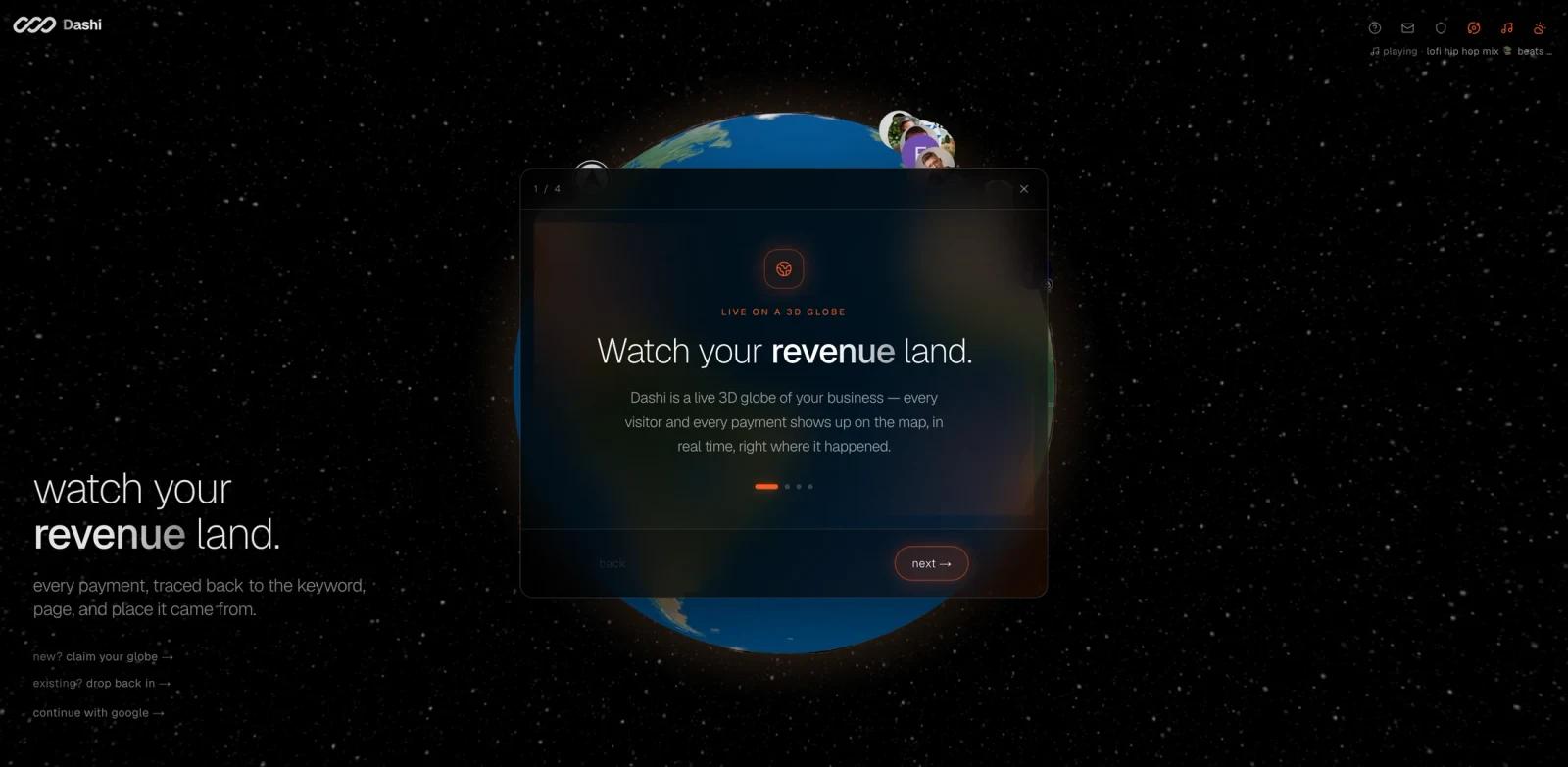
Dashi Metrics is a live analytics product that maps website, visitor, and revenue activity onto an interactive 3D globe. Its Product Hunt launch tagline was "Visualize your revenue on a 3D globe," and the official homepage positions Dashi as a more playful and spatial way to see what is happening across a website or business.
The product appeared as the fifth-ranked Product Hunt launch in the latest Hunted.Space snapshot reviewed for this listing, with more than 200 upvotes. It is worth publishing because it is a clear, visual product with a specific use case: helping founders and SaaS teams see customer geography, payments, and activity in a way that feels more alive than a table or static dashboard.
Dashi Metrics belongs near AI data visualization and AI data analysis, even though the strongest public signal is the visualization experience itself. For ToolWorthy readers, the practical question is whether a globe-based view creates faster insight or simply makes analytics more engaging. The answer depends on whether geography and live activity matter in the business.
Key Features
- 3D globe analytics - Maps business events such as visitors and payments onto a dynamic globe.
- Live activity view - Product Hunt launch copy emphasizes real-time customer and payment activity.
- Geographic revenue context - Helps teams understand where usage, traffic, and revenue are coming from.
- Interactive exploration - Users can spin, zoom, and inspect global patterns instead of reading only static charts.
- Founder-friendly presentation - The product is designed to make business momentum visible and shareable.
- Free tier signal - The launch discussion mentions a free tier for Product Hunt users to try.
Pricing & Plans
Dashi Metrics' official public homepage reviewed for this listing did not expose a detailed pricing table. The Product Hunt launch discussion mentions a free tier, so this listing treats Dashi Metrics as freemium until a full pricing page is available.
| Plan | Public signal | Notes |
|---|---|---|
| Free tier | Mentioned in launch discussion | Useful for testing whether globe analytics fits your workflow |
| Paid plans | Not fully public | Confirm plan limits, event volume, integrations, and team access before buying |
| Business use | Likely usage-dependent | Review data refresh, history, exports, and privacy terms for production use |
Teams should verify whether Dashi supports their analytics source, payment provider, event schema, and retention needs. A visual analytics tool is only valuable if the underlying data is complete enough to trust.
Best For
- SaaS founders who want a more engaging live view of customer activity
- Indie hackers tracking signups, visitors, and payments during launches
- Marketing teams that care about regional campaign performance
- Product teams looking for visual complements to traditional dashboards
- Teams that want a shareable analytics display for offices, launches, or investor updates
FAQ
What is Dashi Metrics?
Dashi Metrics is a 3D globe analytics tool that maps visitors, payments, and business activity geographically.
Is Dashi Metrics free?
The Product Hunt launch discussion reviewed for this page mentions a free tier. A full public pricing table was not visible on the official homepage, so confirm current pricing directly.
Who should use Dashi Metrics?
Dashi Metrics is best for founders, SaaS teams, and marketing teams that want to visualize where customers, traffic, and payments are happening.
Is Dashi Metrics a replacement for analytics dashboards?
Not completely. It can make activity more visible and engaging, but teams should still use detailed dashboards for metric definitions, cohorts, funnels, and finance reporting.
What should I test first?
Connect a small, real data source and check whether the globe reveals geographic patterns that your current dashboard hides or makes hard to see.